How to Pick the Perfect Color Palette for Your Design: A Guide for Creatives 🎨

Choosing the right color palette is a crucial step in the design process. It’s not just about making things look visually appealing—it’s about conveying the right message, setting the right mood, and ensuring your design stands out. Whether you’re designing a logo, a website, or a piece of art, the right palette can make or break your project. ✨
In this guide, we’ll walk you through how to pick the perfect palette for your design.
Understanding the Role of Color in Design 🎨
Before we dive into how to pick the perfect palette, let’s first understand why color is so important in design.
-
Colors Set the Mood: Different colors evoke different emotions. Warm tones like red and orange can feel energizing and passionate, while cool tones like blue and green can bring calmness and professionalism.
-
Brand Identity: Colors play a huge role in branding. Companies like Coca-Cola are instantly recognized by their iconic red and white color palette. When choosing a palette, think about the emotions and identity you want to convey. 💼
-
Visual Harmony: A cohesive color palette makes a design feel balanced and easy to look at. Too many competing colors can overwhelm the viewer, while too few may feel flat. 🎯
With this in mind, let's go through the steps for picking the perfect color palette.
Step 1: Understand the Basics of Color Theory 🎨
Before choosing colors, it’s helpful to have a basic understanding of color theory:

-
Primary Colors: Red, yellow, and blue—these form the foundation of any color palette.
-
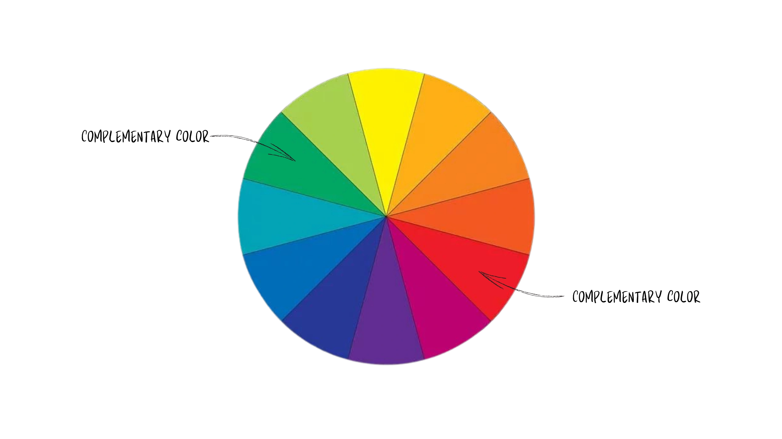
Complementary Colors: Colors opposite each other on the color wheel (like red and green) create contrast and make each color pop.
-
Analogous Colors: Colors next to each other on the wheel (like blue, blue-green, and green) create a harmonious, cohesive look.
This knowledge helps when you're selecting colors that balance contrast with harmony, ensuring your design is visually engaging. 💡
Step 2: Choose a Dominant Color 🌟
Start by choosing a dominant color that will serve as the foundation for your palette. This color will reflect the primary mood or emotion you want to convey in your design. For example:
- If you're designing for a tech company, a cool, calming color like blue could evoke trust and professionalism. 🔵
- For a fitness brand, vibrant colors like red or orange might communicate energy and excitement. 🟠
Once you’ve chosen your dominant color, you can build your palette around it.
Step 3: Select Complementary Colors 🔲
After choosing your dominant color, it's time to add complementary or supporting colors. These secondary colors should enhance your dominant color and maintain balance.
-
Use Complementary Colors for Contrast: If you want your design to pop, use complementary colors to create contrast. For example, pairing a blue dominant color with orange accents creates an energetic balance.
-
Use Analogous Colors for Harmony: For a more subtle look, select colors next to your dominant color on the color wheel. For example, if you choose blue, you might add shades of blue-green or purple to maintain visual harmony.
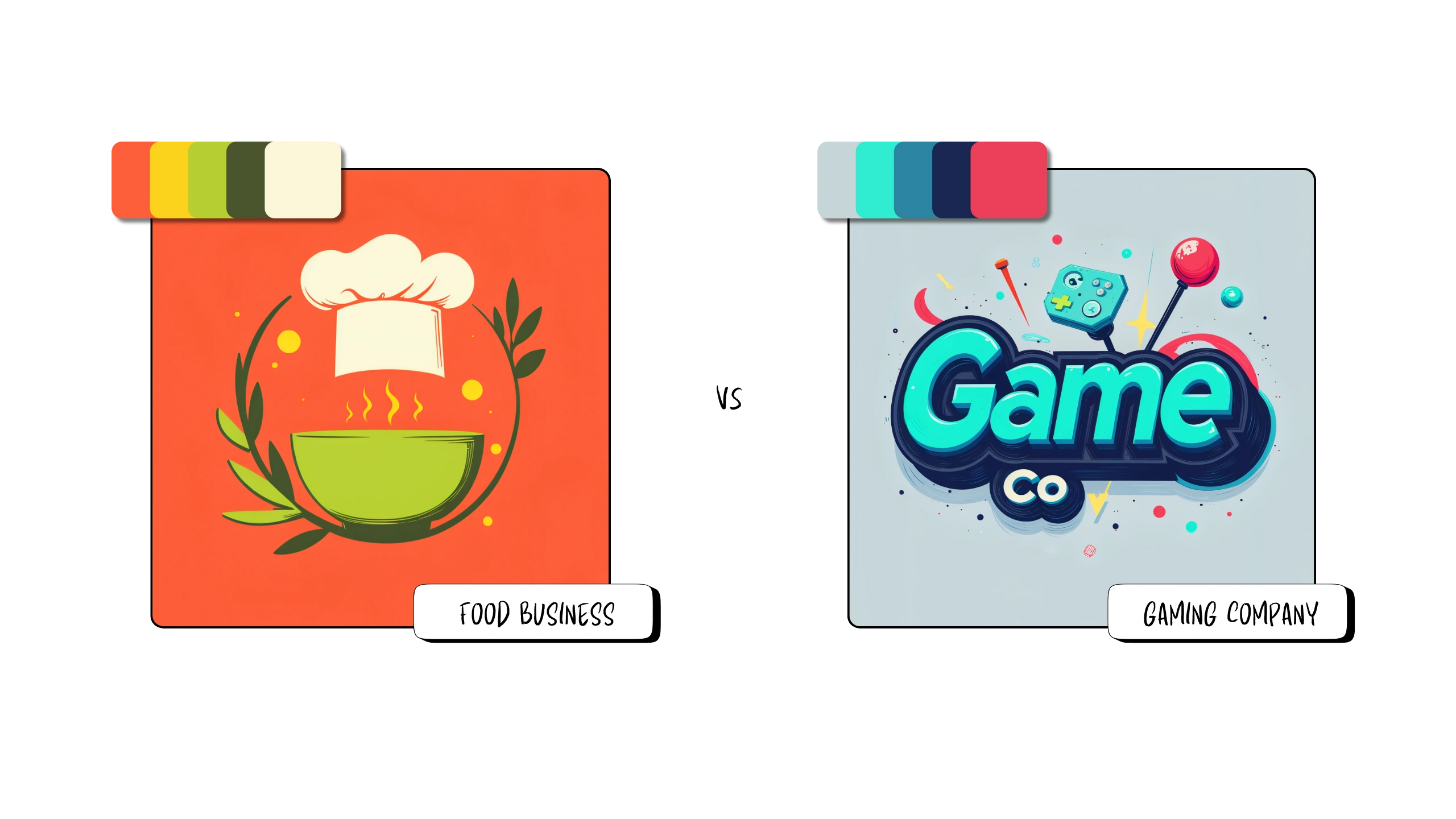
Step 4: Consider Your Industry or Project Type 💼

The type of project you're working on can also influence your palette choice. Think about what your design needs to communicate:
-
Corporate Designs: Stick to neutral, classic palettes with blue, gray, or black for a professional feel.
-
Creative Projects: Experiment with vibrant, bold color combinations to convey energy and creativity. 💥
-
Minimalist Designs: Often benefit from neutral palettes with shades of black, white, and gray or monochromatic color schemes. ⚫⚪
Step 5: Add Your Custom Color Palette with Brushless 🎨

Once you’ve selected your ideal palette, you can easily integrate it into your design with Brushless. Here’s how:
-
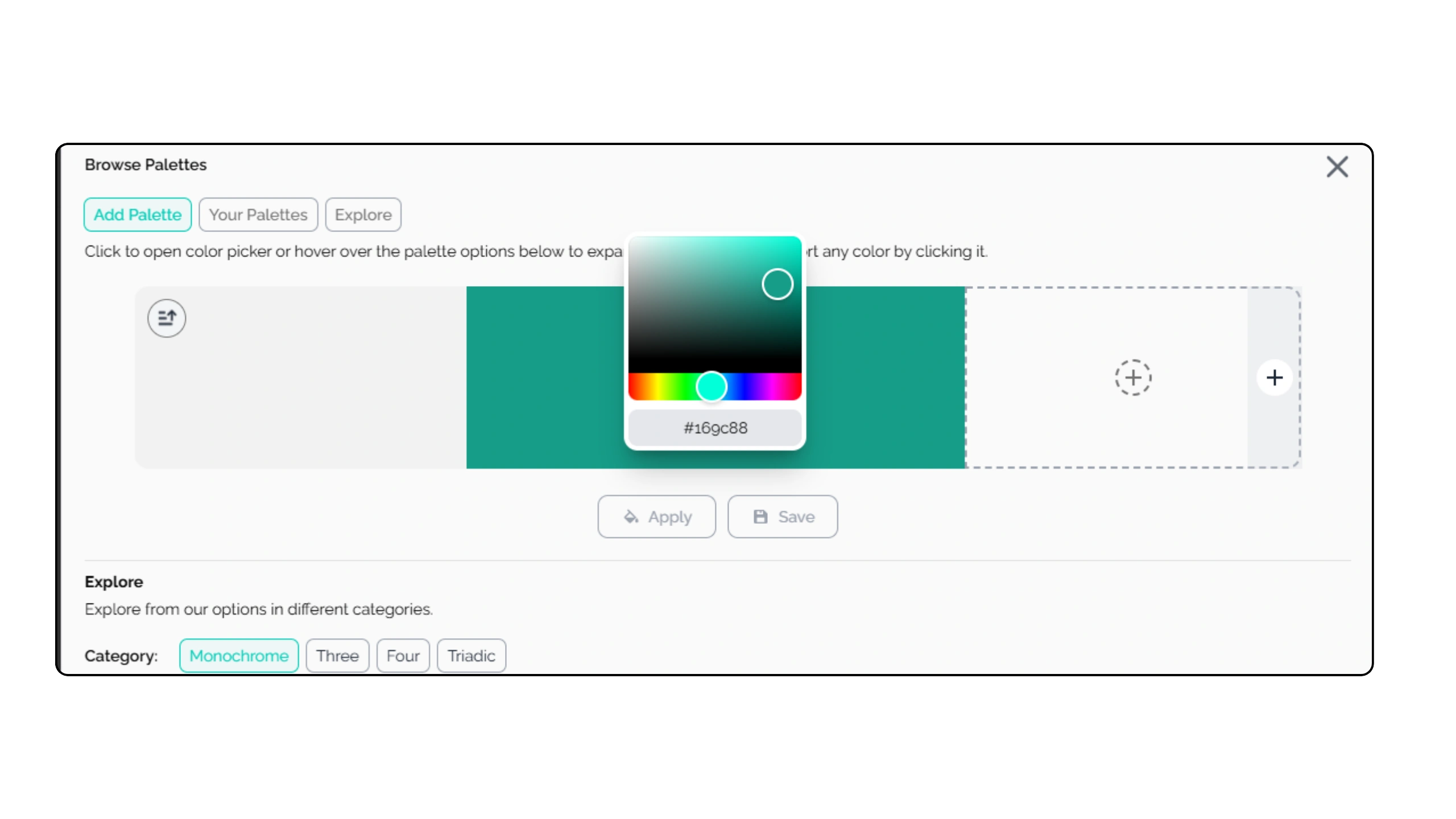
Custom Color Input: If you have specific brand colors or hues in mind, you can input custom hex codes to create your unique palette.
-
Apply Colors to Your Design: After inputting your colors, Brushless lets you apply your custom palette directly to your design, whether you’re creating vector art, illustrations, or logos.
-
Refine and Experiment: If you want to fine-tune the look, you can tweak the color intensity, brightness, or saturation within the platform to ensure your design matches your vision.
Step 6: Use Brushless' Suggested Palettes 🎨
If you're not sure which colors to choose, Brushless offers curated palette suggestions that can guide your decision. Based on your design’s theme, style, and tone, Brushless provides palettes that work well with your project. Simply select one of these pre-made palettes, or use them as inspiration to create your own customized version.
Step 7: Test and Adjust Your Palette 🔧
Once you’ve chosen your colors, it’s always a good idea to test them in different design contexts. How will they look on a website? On social media? In print? Brushless allows you to experiment with your color palette and see how it impacts your design, helping you make adjustments before finalizing it. You can generate different designs with different styles and aspect ratios, to see how well your chosen colors go together.
Final Tips for Picking the Perfect Color Palette:
-
Less is More: Limit your palette to 3-5 colors to keep your design visually clear and focused.
-
Contrast is Key: Ensure there’s enough contrast between colors to make your design readable and dynamic.
-
Brand Consistency: Stick to a consistent color palette across your branding materials for a unified look.
Conclusion: Choose Wisely with Brushless! 🖌️
Picking the perfect color palette doesn’t have to be overwhelming. With the right approach, a basic understanding of color theory, and the flexibility of Brushless, you can create a palette that enhances your design and communicates your message effectively. Whether you're refining a logo, creating illustrations, or building a brand, the tools Brushless provides make color selection intuitive and customizable.
Start experimenting with your palette today! Generate a design with Brushless! 🚀


